Category: Webmaster News

Diggbar Feedback (and how not to collect feedback)

Posted by – April 6, 2009

Digg recently introduced a feature that frames the content posted to Digg, reminding me of the internet in the 90′s, where framing other people’s content to put ads on top of (remember about.com’s ubiquitous frames?) was commonplace and when one of the first bits of JavaScript I used was a “frame buster” that would prevent those obnoxious banners above my web pages.

But I’m not writing this to rip on Digg. Their “Diggbar” is a good example of why the old “banner in a frame” tactic began to die off and why things like the Diggbar can succeed.

As in any such case where you are breaking the fundamental way people expect the internet to work (in this case by framing the destination url) the tradeoff between usefulness and annoyance is what will make or break this feature and Digg has some useful (for some) features included like:

  • URL shortening. Twitter’s character limit has sparked a renaissance in short url services, and Digg made it easy to create them by appening any url to digg.com/ (e.g. digg.com/http://agilewebmasters.com/robert/diggbar-feedback/).
  • Access to comments and related submissions. In my experience with Digg the top ranked comments often provide useful mirrors, context or even refutation. Some will find their inclusion in the Diggbar useful in this format. As to related submissions once they manage to make this useful (they are surprisingly bad at term extraction, but I’ll write about this some other day) this too can serve as an additional exploration point for their users.
  • Digg/Bury. Providing access to their users to digg and bury articles while reading the actual article in a frame is a good thing. Their users don’t need to vote on an article grid or go to the comments page and can go to a single destination for both content and the core digg functions.
  • Random. This opens up an entirely new use pattern for digg bringing the serendipity of StumbleUpon and allowing for even more casual content discovery. This is by far the most game-changing part of the Diggbar, and in my opinion this should be reflected in the interface UI by giving it more prominence on the toolbar. Personally, I’d put it where they have their logo right now and incorporate the logo into the random button (call it “digg shuffle” and you are just a lower-case “i” away from the hearts and minds of a sizable cult following among their user base).

But I most likely won’t be using this feature (call me old fashioned but I like the traditionalist notion that links to another site are best served by an actual link to the other site, not a link to your own site with a frame, and yes I am inordinately parenthetical) and digg had the good sense to include an easy way to opt out of this permanently instead of only providing the traditional “remove this frame” option of the 90′s. Without this option I’d likely not use digg anymore. Hell, the fact that reddit provides a direct link to the submission url in their rss feeds is one of the biggest reasons I’ve seen my time on reddit increase and my time on digg decrease over time. For many reasons I like less, not more, between me and the content I’m trying to see.

But now that I got that convoluted rambling out of the way, I’ll get to what prompted me to write up a post in the first place, and that is something digg got fundamentally wrong.

  1. Despite my reservations,  I wanted to try the casual content discovery that is random browsing. I clicked on the Diggbar’s “random” button a few times before a solicitation for feedback pushed the buttons over and caused my next click to launch a popup to twitter.

    That brought my foray down digg’s random path to an abrupt end, and if they are introducing a “toolbar” that they hope will drive more such use they should take greater care to make UI elements predictably positioned, especially if it’s a button whose typical use pattern involved frequent clicks (I note with great humility that my brilliant “digg shuffle” idea would have precluded this).

  2. They are soliciting feedback through SurveyMonkey.com, and I’d already provided feedback. So far so good but now I discover that this link leads me to a page saying “Thanks for Taking the Survey.  Looking to Create Your Own?” and does not allow me to provide any additional feedback.This is daft for several reasons. An obvious reason to start with is for continuing to solicit feedback when I can no longer provide it but that doesn’t even begin to address the more fundamental mistake of using such a third party provider that can’t handle the simple use case of a user having feedback and then, as in my example of seeing additional behavior after the first feedback was provided, having more. It’s not much more difficult to roll their own simple and scalable solution for feedback through Google App Engine or Amazon Simple DB than it is to use a third party with such limits on their users’ experience and that is the solution I’d elect in their shoes, but even if they wanted to eat someone else’s dog food they could have at least provided a more useful forum such as Google Moderator or Get Satisfaction that would have allowed for more than one instance of feedback (though given the open communication they might be more transparent than digg prefers for their initial feedback).As it stands, I had feedback that they’ll have to happen upon on this blog post to read (8-ball says “Outlook not so good” and tossed in “nobody reads this blog anyway”), and that their medium could not collect. There are more elegant solutions to prevent sock puppetry than such a limitation and if I were running a site digg’s size I’d want to get the basics right. And to be fair, if they were in my shoes, they’d probably be headed to bed right now instead of waxing loquacious on such usability inanities at this hour.

Google adds ‘Suggest’ feature to homepage

Posted by – August 30, 2008

Google suggest is a handy feature that displays a list of likely search terms as you are typing them. This feature is usefull for several reasons:

  1. It often stops you from having to type your entire search phrase in
  2. It’s a quick way to check the spelling on a word
  3. It gives you an idea of what a good search phrase is that is related to what your after

This feature has been around in google labs for awhile. A form of it is also used in the search bar of firefox (although the search bar only displays phrases, and not the number of results each will return). So the feature itself isn’t new, but making it the default on the homepage for all users (even guests) is a big deal.

I think it is a good move. Of course they want their homepage lite and responsive, but I believe the functionality is worth the extra pageload. Beside, an Ajax search like this really doesn’t take much javascript when done right. In fact, I recently implemented a similar feature for searching tags on able2know.

I implemented it without the help of javascript libraries, although I do have a javascript file I’ve written that contains a small set of usefull tools, such as targeting elements, sending ajax requests, or validating json data. Using these helper functions, my search code becomes this simple:


var tagSearch = {
	init : function(){
		tagSearch.e = $('tagSearch');
		tagSearch.resultBox = $('tagSearchResults');
		tagSearch.original = tagSearch.resultBox.innerHTML;
		tagSearch.e.onkeyup = function(e){
			if(tagSearch.e.value != tagSearch.lastValue){
				tagSearch.lastValue = tagSearch.e.value;
				if(tagSearch.e.value.length > 1)
					Ajax.get('/rpc/tag/search/?s=' + tagSearch.lastValue, null, tagSearch.update);
				else if(tagSearch.e.value.length == 0)
					tagSearch.resultBox.innerHTML = tagSearch.original;				
			}
		}
	}, 
	update : function(r){
		var data = JSON.parse(r.responseText);
		if(data.html){
			tagSearch.resultBox.innerHTML = data.html;
		}
	}	
}

On the php side of things, I am returning html to keep things simple. Pretty easy, eh?

Able2know launches

Posted by – August 25, 2008

Able2know has long run an experts exchange on phpbb, but has recently launched a new custom software to replace the old forums. This software was developed by two of us Agile Webmasters (Nick Ashley and myself) over the course of the last 10 months or so and while we launched quite rough it’s been evolving quickly in the days since and we are committed to making it a very rich and usable web application.

Over the course of the next weeks we’ll talk about our development process and decisions to give advice to others facing similar challenges but you are welcome to ask us questions about web development on able2know anytime.

Sitemeter disables IE browsing, hopes no one notices.

Posted by – August 2, 2008

Web Analytics service Sitemeter pushed out an update to their tracking code sometime early this morning. Unfortunately, it contained a bug that would stop Internet Explorer users from being able to access any site using the code. Apparently Sitepoint needs a few more QA testers on their team.

A bugfix has now apparently been pushed out, and the issue no longer exists. Whats interesting, however, is that Sitemeter has made no mention of their snafu. I understand that when the bug is discovered, their primary goal is to get it fixed, not issue official statements. However once they pushed out the fix, a simple “Sorry we screwed up, we just pushed a fix out, let us know if there are any more problems” should be in order.

Yahoo Search now uses Yelp and LinkedIn apps by default

Posted by – August 1, 2008

Yahoo’s response to Google’s universal search is SearchMonkey. Inspired by the JavaScript-based website extension from Greasemonkey it is a Facebook Apps style platform where apps (called “Enhancements”) run on Yahoo’s search results, extending them with structured data. Yahoo allows users to add and remove these apps from their search results through the Yahoo Search Gallery.

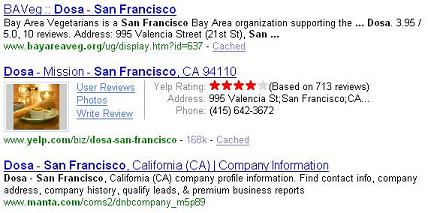
Have a look at what it looks like in practice. In this search, Yelp.com’s result in the search now has structured data from Yelp’s search enhancement.

Microsoft launches new Live Search homepage design

Posted by – July 31, 2008

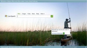
Microsoft has launched a new design on the home page of their Live.com search engine that you can see in the screen shot to your left.

The image has squares that link to different searches (image, map and web). For example, in the screen shot here the tool tip reads “What will you see on your Safari to Botswana?” and links to an “animals in Botswana” search.

I expect that they’ll use other images and search in the future, and this has a lot more to do with the branding of their search assets than any functional change. Because there is a lower cost of entry to having mapping and image search Microsoft’s maps and supplemental search services sometimes have more bells and whistles than Google’s equivalent features and Microsoft is keen to get these in front of people.

Earthlink intersted in AOL’s dialup business

Posted by – July 30, 2008

Andrew Lavallee writes for the Wall Street Journal that Earthlink is interested in purchasing AOL’s dialup subscriber business. At this point it does indeed look like a promising pair because there aren’t that many players trying to consolidate yesterday’s markets.

For a bit of history, AOL was late to diversify its business away from its once dominant dial up empire it built. It missed the broadband revolution and ended up pretty much selling access to its walled garden of content and email services to broadband users who had another internet service provider but still wanted their AOL mail.

Even worse was how late AOL was to modernizing the monetization of their content. While other portals built publishing empires and search advertising AOL kept their content walled to subscribers, essentially sticking to a paid content business model where they would charge monthly fees for dial up access and content or just the content while the user paid someone else. They eventually woke up and opened up their AOL content as a public portal but they were once again too late to be a dominant player and now merely have a lot of fading eyeballs that need to be sold to a real internet company.

Needless to say, the web has moved on and AOL is a declining asset that Time Warner is famously willing to part with. And its dial up business is a declining asset within this declining asset that has few takers.

Cuil Search Engine launch

Posted by – July 30, 2008

Search has been the sexy web app for years, with only social networking threatening its status as the cool king of web applications. And anyone gunning for Google seems to get a lot of attention. A husband and wife team of former Google employees launched a search engine called Cuil (pronounced “cool”) this week and the web was abuzz with the drama.

“Ex Googlers build Google killer” was the salacious angle behind the buzz, but when the search engine actually launched, the poor quality of its results and unreliability of the service generated a counter-buzz backlash. That Cuil representatives seemed snappy in response to the criticisms didn’t help and I’ll go ahead and predict that this search engine won’t go anywhere.

They differentiate themselves from the current search engines with a different user interface that is simply a lot less usable and while they claimed to have the largest index upon launch, they don’t and their relevance is behind all the major search engines (even Microsoft’s).

There is speculation that they launched this search engine in the hopes of being bought by a search engine like Microsoft, who has shown a willingness to spend big money this year (Yahoo takeover attempt, Powerset aquisition) to get search IP, market share, and talent.

That may be all that Cuil brings to the table. They went cheap on the backend and can’t realistically challenge for Google, Yahoo or even MSN scale. Their best hope is that Microsoft sees enough value in them to purchase them.

Checkout by Amazon launches

Posted by – July 29, 2008

Amazon Checkout has launched, extending Amazon’s range of web services and diversifying the payment processing service implementations they offer. With their Flexible Payment Service and Simple Pay they now offer a wide range of tools to develop applications with complex transaction for developers without the resources to be a middle man in financial transactions. This new service seems most useful for simple e-commerce use cases.

Checkout by AmazonTM is a complete ecommerce checkout solution that provides your customers with the same secure and trusted checkout experience available on Amazon.com today. It offers unique features including Amazon’s 1-Click® and tools for businesses to manage shipping charges, sales tax, promotions, and post-sale activities including refunds, cancellations, and chargebacks.

Their range of solutions can be overwhelming, so check out a comparison of the features.

Google Knol now open to everyone

Posted by – July 23, 2008

Google’s Knol service is being billed as a Wikipedia killer, and while it has its similarities in purpose it has differences in implementation that set it apart. First of all, the Knols (individual units of knowledge) are not as open as Wikipedia. Individuals can collaborate in groups but you can also make control your own knol and be its sole contributor.

In practice this means that there can be many Knol articles about the same subject and this will mean less consolidation and more diversity. The mission statements are very different as well, and you don’t need to write with a neutral point of view on a Knol and can produce original research. You can probably post a lot of pure garbage that wouldn’t be allowed on Wikipedia on a Knol.

The effect that I predict that this will have is that Knols will be more like individual web pages than a Web Encyclopedia. And they are going to tend to be more commercial and less academic without the encyclopedic purpose and with the revenue sharing of Adsense ads that they will offer their contributors.

Expect a SEO heavy crowd in the early stages. This is going to be more like blogging that Wikipedia in effect.